How to identify deception in infographics: key manipulation techniques
Infographics should simplify the understanding of data, but they can also become a tool for manipulation. Special techniques and accidental errors can completely distort the meaning of information. We will tell you what to look out for so that you don’t fall victim to visual deception.
Infographics are a visual way of conveying information using graphic elements such as images, diagrams, blocks, and charts. Their purpose is to visually highlight patterns, connections, and trends in data, making them more clear and easier to understand.
One of the important properties of infographics is strict adherence to data. If the visual parameters of the elements do not correspond to the numerical values, the infographics become not just useless, but downright misleading. Such distortions can be divided into deliberate manipulations aimed at deceiving the viewer and errors caused by ignorance or inattention. However, both types equally undermine the reliability of the information. That is why the design of infographics requires close attention.
Deliberate distortions
1. Manipulation of axes and scale — the most common method of visual data distortion, affecting the perception of proportions and trends.
- Truncated Axis: The axis (usually the Y-axis) does not start at the origin (usually zero), which visually exaggerates minor differences.
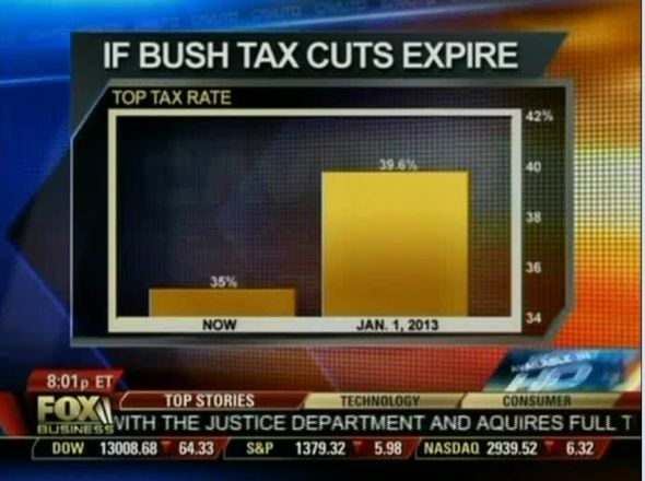
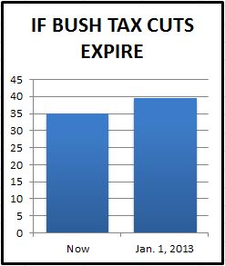
In 2012, Fox Business used a graph with a highly distorted scale, exaggerating the effect that the end of President Bush’s tax breaks would have on high-income citizens. For comparing tax rates during the Bush (35%) and Clinton (39.6%) eras, the channel used a graph where the columns started at 34%. This trick created the false impression that the difference between the values was almost double, when in reality the increase was less than 5 percentage points.
- Inconsistent scales: Visually comparing two or more data sets on graphs with different axis scales, distorting the true relationship between the indicators.
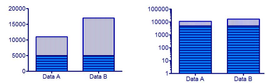
- Unspecified nonlinear scale: Using a logarithmic or power scale without clearly indicating this. On such a graph, the distance between 1, 10, and 100 looks the same, as a result of which a steep growth line may look slow and smooth, misleading the viewer.
- Distorting the proportions between axes: Intentionally compressing or stretching one axis relative to another to amplify or smooth out the visual slope of curves.
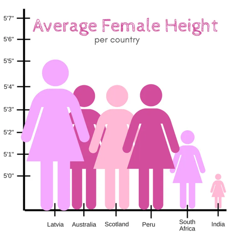
Example: A comparative graph showing the difference in average height of women in different countries. Looking at the image below, one might think that women in India are three times shorter than women in Latvia. In reality, the difference is not that great, but the height scale is constructed in such a way that a visual gap of 1 inch is visually equal to a gap of 1 foot. Because of this, the actual difference of 7 inches (17 cm) is visually magnified to incredible proportions, misleading the audience.
©
2. Substantive and statistical distortions — manipulations related to the data itself and its interpretation.
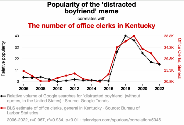
- Substitution of correlation for causation (a connection that does not exist): A graph showing the simultaneous change in two variables is presented as if one directly influences the change in the other, without evidence. For example, a graph may show a correlation between ice cream sales and cases of sunstroke, but this can be explained by a common factor — hot weather — rather than ice cream causing overheating.
- Cherry-picking: Using only data or time periods that support the author’s thesis, ignoring contradictory information. Example: An investment company advertises a fund that has grown by +200% over 5 years, while remaining silent about its other 9 funds, which have shown zero or negative returns.
- Failure to indicate uncertainty: Presenting point values (e.g., averages) without confidence intervals or measurement errors can create a false impression of accuracy.
- Incorrect data aggregation: Averaging that hides important internal variations and outliers (“average temperature across the hospital”).
- Diagrams that lead to incorrect conclusions: Logical errors in diagram construction (e.g., incorrect cause-and-effect chains, Venn diagrams with incorrect set intersections).
The next section will examine unintentional errors and cognitive biases that reduce the informative value of infographics, and propose a method for verifying them.